Role
Solo Graphic + UX / UI designer
tools
Figma, Adobe Illustrator, Photoshop, InDesign
timeline
February 2024 ( 1 month Research )
March 2024 - May 2024 ( 3 months in Concept + Design )
Project brief
summary
As a first generation graduate, I chose a topic very close to my heart — senior nutritional health. Having been raised in a very independent Filipino multi-generational household, the importance of the presence of our previous generations throughout our lives is paramount.
This is where I found SARIWA ( Fresh in Tagalog ). SARIWA's mission is to bring Filipino food into modern health times, while maintaining traditional Filipino flavors building healthier eating habits & create new mindsets to impact future generations — disrupting the current eating cycle & creating a healthier way of life for our elders.
Not only will SARIWA keep our elders with us longer, but it would also build a new platform for Filipino foods to new comers! Bringing Filipino flavors to every table.
task
Design a capstone product that solves our chosen problem.
6 design pieces minimum:
1 interactive ( ex. website, app, book )
3 Environmental
2 Supporting Designs ( choice of 2 - takeaways, motion graphics, or packaging )
problem
Filipinos above the age of 40 make up at least 1/3 of Las Vegas’ population of 600,000. 95% of those Filipinos are diagnosed with significant health issues directly related to their diet.
Thyroid, Diabetes, Gout — all illnesses that can be addressed through diet when caught at the correct time.
solution
Our goal moving forward is to provide a healthy comfort food option so that all can continue to live strong while also enjoying traditional Filipino flavors they love and making iconic recipes easily accessible to anyone curious of southeastern island flavors.
thesis
My solution is to create a food service that would partner with medical professionals to create curated meals. Tailored to specified health issues that coincide with dietary needs per individual as well as a general option of healthy and modern versions of staple Filipino plates for everyone to enjoy, delivered directly to your home.
Our mission is to align Filipino meals with more modern health and culinary times, while keep traditional Filipino flavors intact. This will help build healthier overall eating habits and correct mindsets that keep our older generations choosing unhealthy versions of such a delicious cuisine — disrupting the thought process of current dietary choices, creating a healthier way of life, and thus impacting our the eating habits of our future generations.
target audience
25+ years old
final design solutions


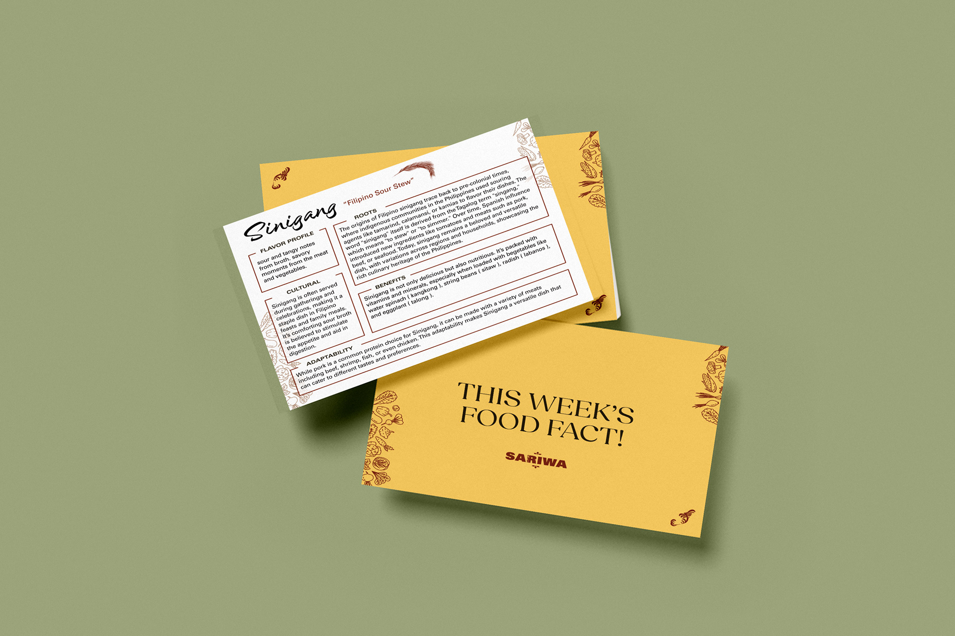
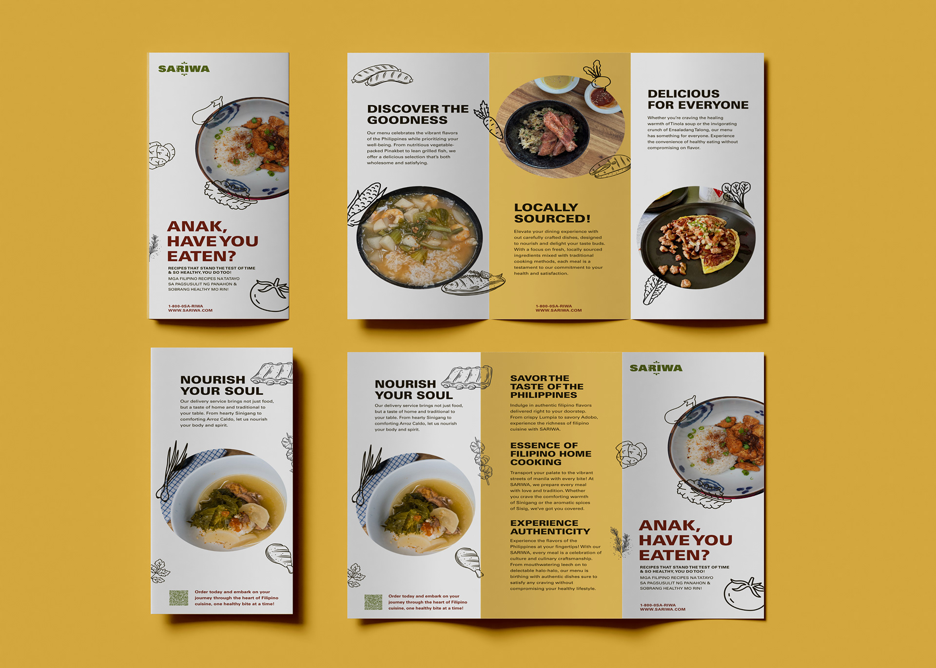

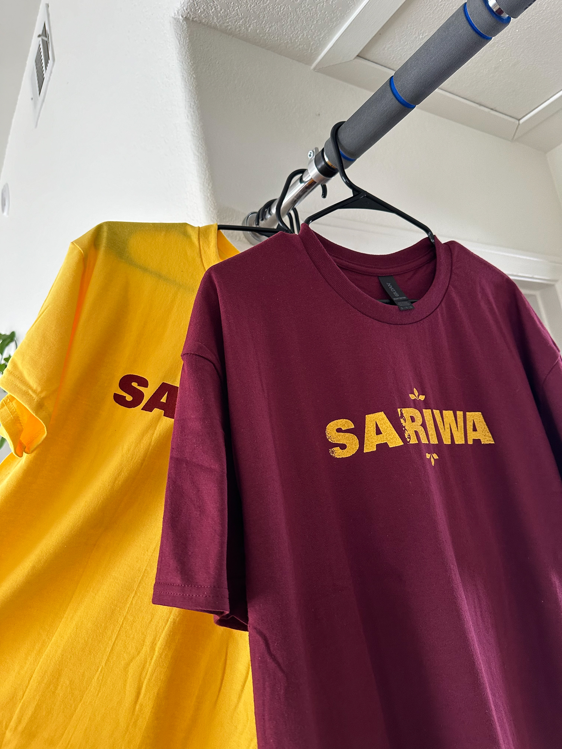
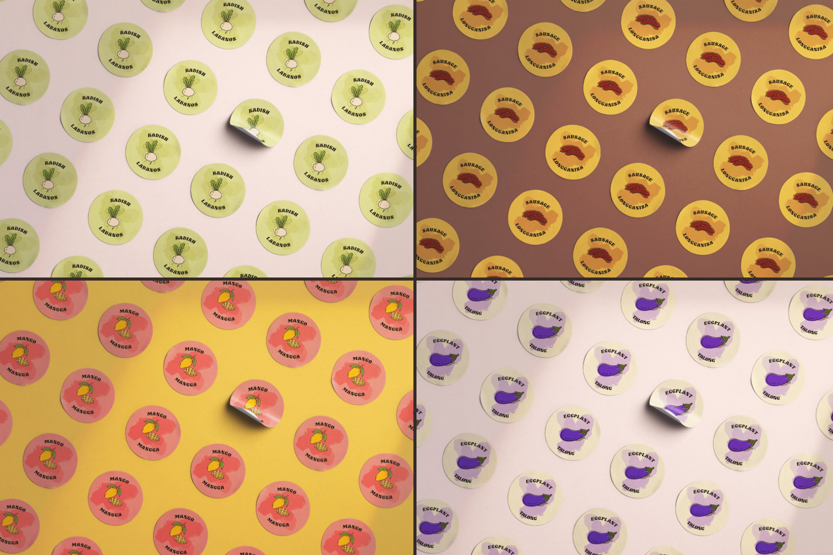
As part of a our nutritional service—SARIWA would work with health professionals to develop healthier versions of traditional Filipino dishes that could be selected through the user’s profile, further customizing their ordering experience as it will work in tandem with the user’s health profile; accounting for low sodium, diabetic, etc diets. These weekly options would be synced with their dietary plan, processed at a facility and then delivered directly to the user’s door, so there’s no defeating feelings when try to shop for new ingredients.
You can view my website prototype through the button below! The website will give you an idea of what a user flow would be like when logging in and customizing a weekly order.
Computer / Laptop Recommended**
project timeline
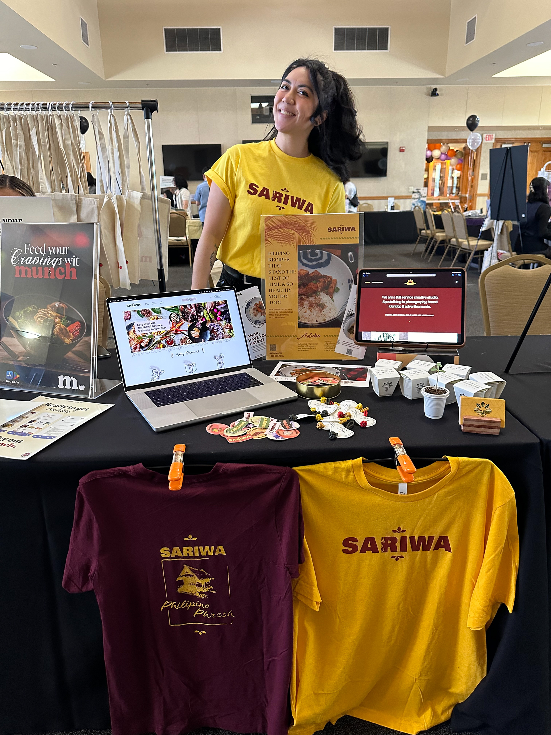
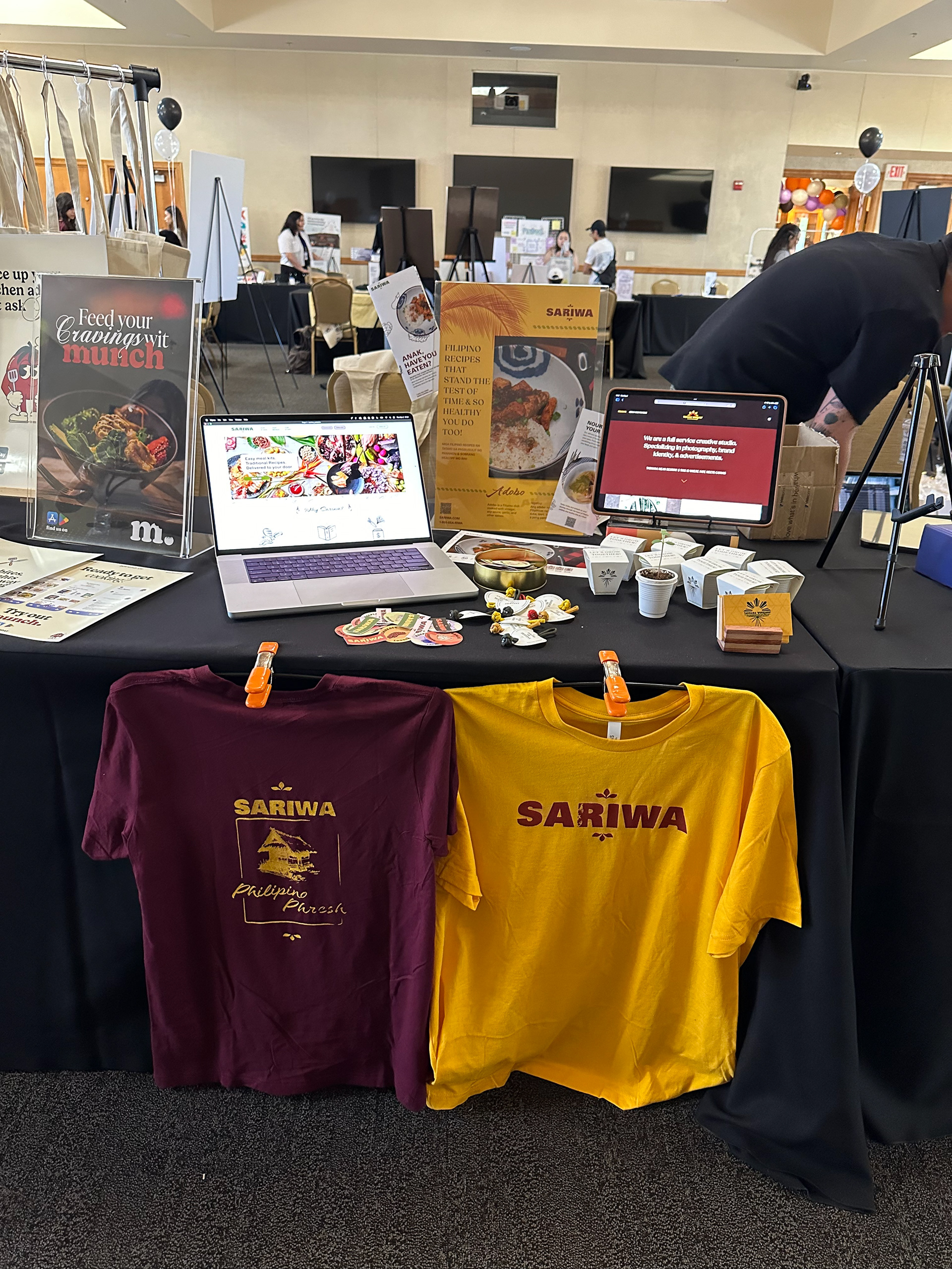
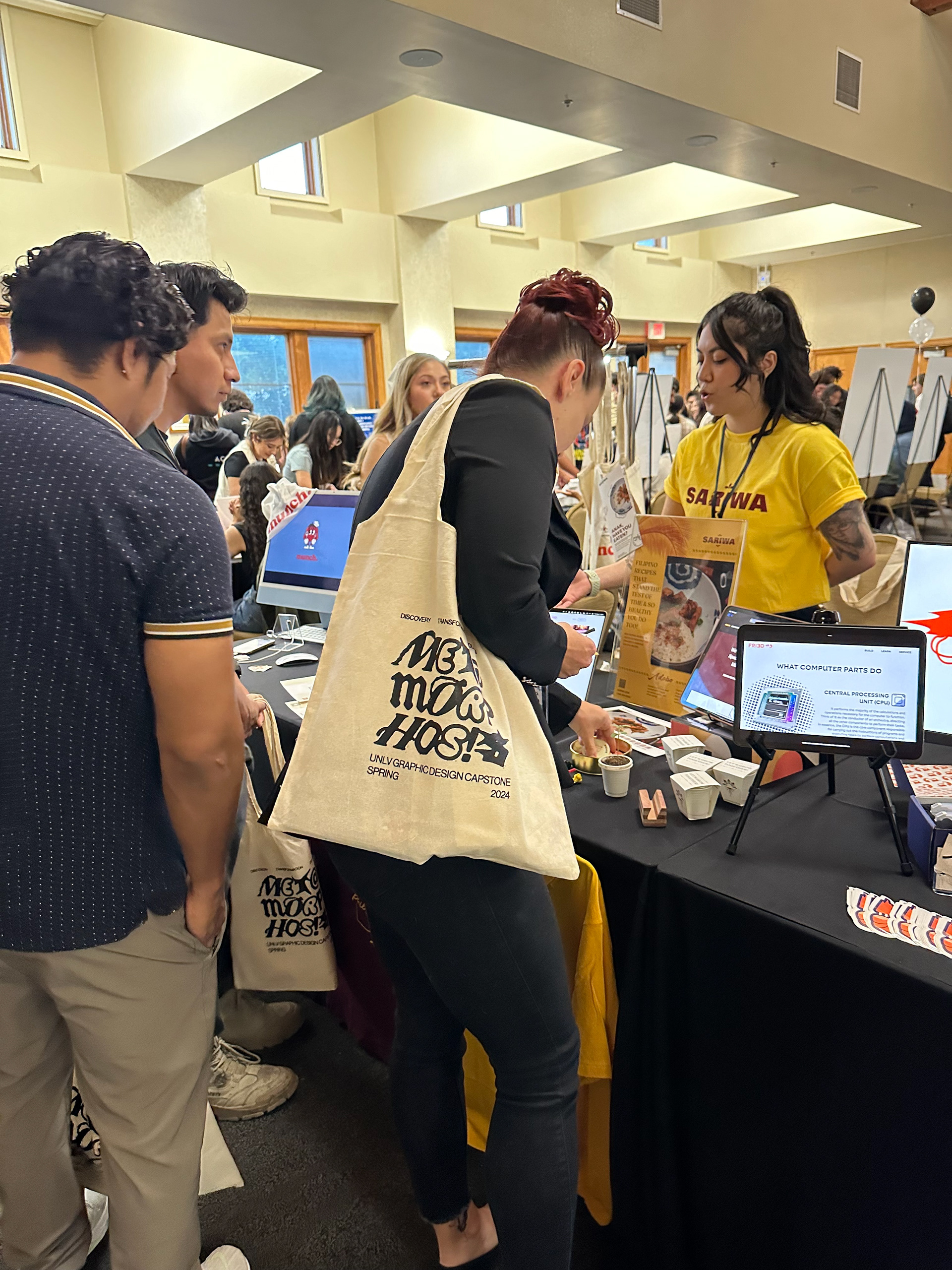
This project began at the start of February with a deadline of May 2, 2024 ( Capstone Event Day ). This allotted for roughly 3 months to complete all designs as well as all finalized ideas to present at the Capstone event where I had the experience of setting up my own display booth.
DESIGN PROCESS
RESEARCH
From the beginning of my capstone project, I knew I needed to research health and its base in nutrition—specifically its roots in diet and the dietary adjustments necessary for certain illnesses.
After establishing my starting point, I was able to decide what problem I wanted to focus on and move forward with developing my design solution. This decision was made after surveying 20 respondents and interviewing 5 individuals of varying ages and genders; all of whom were Filipino ranging from perfect health to having existing health conditions like gout, diabetes, etc.
Methods & Research Types Used
Secondary Research, Primary Research, Qualitative, and Quantitative
BRAND IDENTITY
NAME
The name SARIWA is the Tagalog ( Filipino ) word for FRESH. I wanted the brand to feel familiar to the target audience with a modern attraction for anyone new looking to discover Filipino cuisine in this new and health format. This was also a recommendation from my Lola ( grandmother in Tagalog ) as we were talking about my concept for this project and how the word FRESH to her made her think healthy eating.
COLOR SCHEME
With the decision to move forward with SARIWA as the name, I wanted a colors to properly convey not only freshness, but also hues that would adequately represent Filipino culture. After mixing many different combinations, I realized the best way to promote the Filipino spirit was to start with hallmark Filipino dishes. To ensure the colors I was sampling were true, I paused and made myself a bowl of Sinigang ( Filipino Sour Soup ) and ended up sampling my colors from that exact bowl.
TYPOGRAPHY
I selected typefaces that were clean, bold and unique. Fonts that were easy to read, easily recognizable and had personality that were similar to many Filipino advertisements through history.
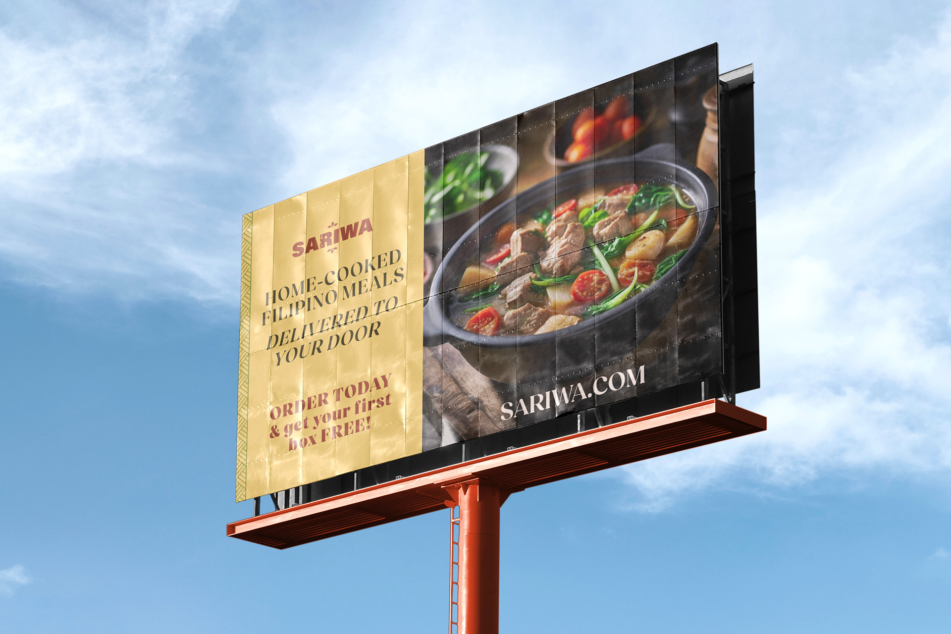
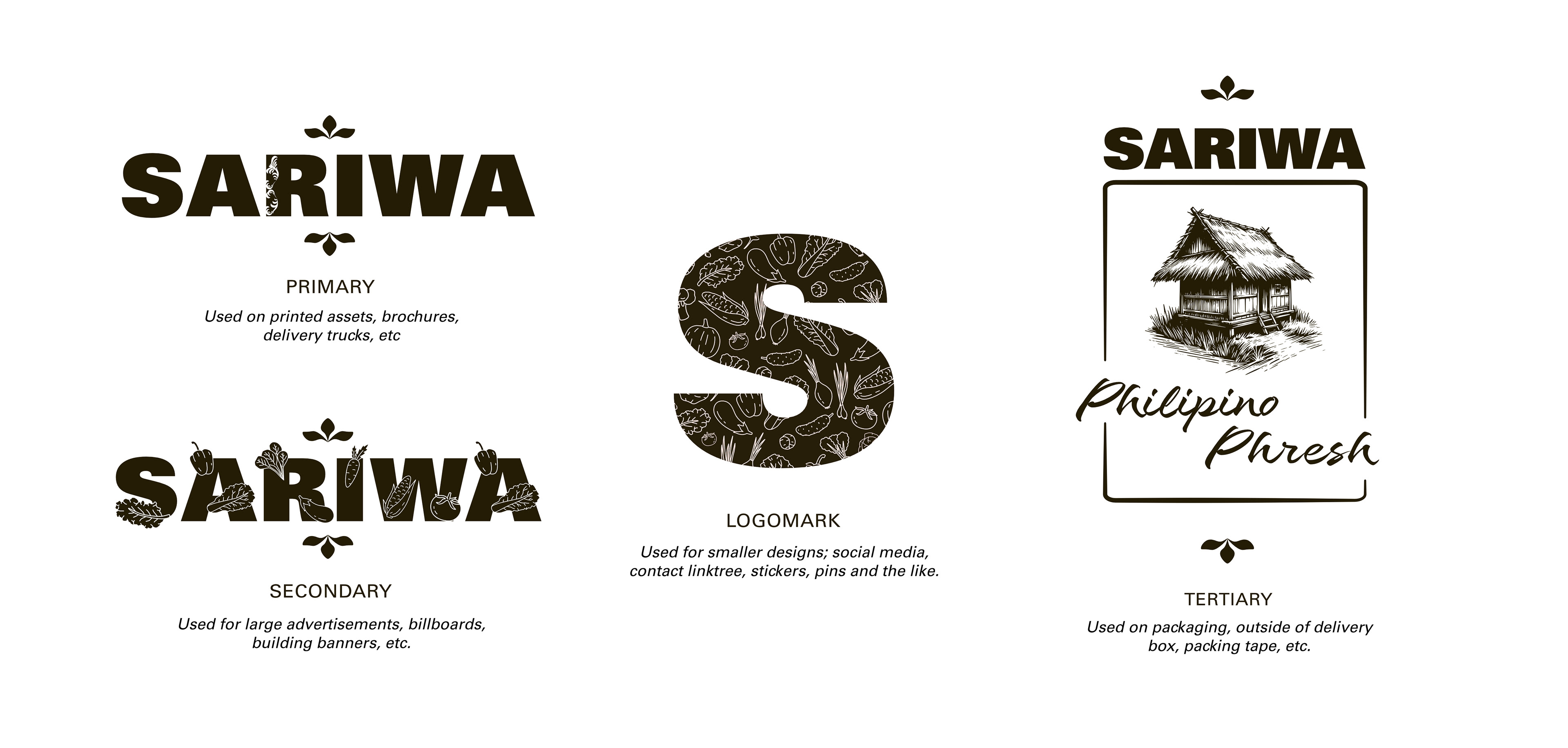
Gotham Black was used in the primary, secondary logos as well as the logo mark to ensure quick recognition for the use in billboards, large advertisements, building banners, and all printed materials—all of which are intended for displaying in medical offices and waiting rooms at hospitals. Gotham Regular was also used in body text and any place that were require simplistic readability.
The typeface Salamat was used in the tertiary logo that was planned to be used in packaging designs, outside of delivery boxes and packing tapes to touch on the familiar connection to the target audience. This typeface was chosen as it was designed by a Filipino artist, Salamat means "Thank You" in Tagalog ( Filipino ) and is a popular style of font in advertisements across the Philippines. The choice to utilize it in all things packaging was to ensure the final interaction with the target audience was familiarity and a feeling of home / comfort.

BOOTH SETUP AT CAPSTONE EVENT
Environmental Piece
Leading up to the Capstone Event, I was fairly nervous. It was the culmination of what all my designs were made for. Once the day arrived, the official set-up was so much fun! Having researched convention booth setups and seeing how artists created their own displays at Las Vegas's Designer Con were very helpful for reference so I had a good idea leading up to it.
CLOSING REMARKS
CHALLENGES
Conducting research was confusing at the start as the initial instructions felt too broad to wrap my mind around beyond what seemed like tight deadlines and steep expectations in a short period of time. Much of the pressure throughout this project stemmed from self-expectation and the drive to be unique. Being the first taste of real world guidelines to exercises in adaptability when print labs were full or feeling that my work was "good enough" to impress.
INSIGHTS
Despite of the challenges, the experience this entire project gave me has been invaluable. The lessons learned through every aspect of each piece are moments of growth I continue to look back on when approaching my projects moving forward. Having embarked on this project thinking I knew myself as an artist and now coming out on the other side with refined confidence with research, adaptive problem solving and an adept level of attention to detail has left me surprised and proud of what I accomplished to say the least.
