ROLE
Solo Graphic Designer
Tools
Adobe Illustrator, Photoshop, InDesign
Timeline
February 2024 - May 2024
PROJECT BRIEF
Summary
Exploring musical genre's of previous decades, I've always been interested by 90's grunge. Growing up in Seattle, WA, you could say that grunge is in my blood and thus a subject I thought to explore further.
Enter SLUDGEPOCKET. This is an exploration of what brand identity of a 90's grunge band would look like and how the marketing materials of the time could support and promote the launch of a new album for a seasoned group looking to re-emerge after a short break.
task
Conceptualize and develop a brand identity for an existing group launching a new album
Required pieces:
Logo
2 Media Mediums
4 Merch Designs
3 Marketing Materials
1 VIP Badge Layout
Design Process
Research
Research began with the bands of the time – Temple of the Dog, Alice In Chains, Sound Garden, Mother Love Bone and Silverchair.
After establishing which bands peaked my interest, I dove into the artist for their album art, posters and merch so that I could also study the artist's style(s) and derive the general concept and name for my group from there.
All research was conducted through historical records and what I was able to find through online sources as I didn't know any of these bands directly nor am I acquainted with anyone from a 90's grunge.
Brand Identity
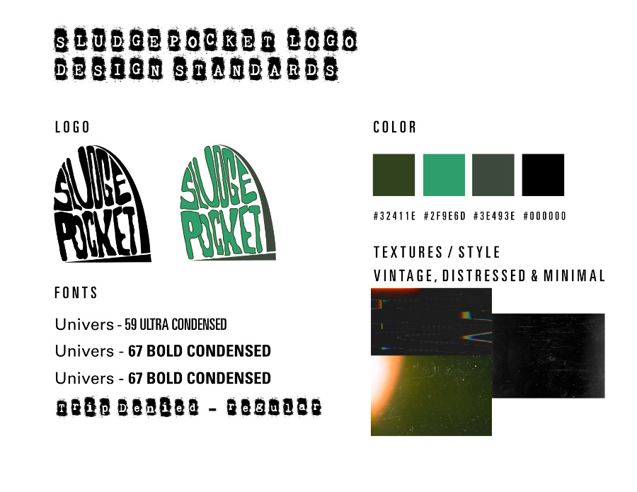
NAME
Grunge in itself was its own exploration by musicians of alternative topics and sounds—death, rebellion, underground, and fighting spirit. I was particularly inspired by my husband and his stories of visiting cemeteries with his group of friends while listening to grunge music.
Taking those topics and backstory into account, I thought explored different words and synonyms associated with cemetery items; headstones, coffins, etc, which led me to SLUDGEPOCKET — essentially what coffins are as a body decomposes.
Color Scheme
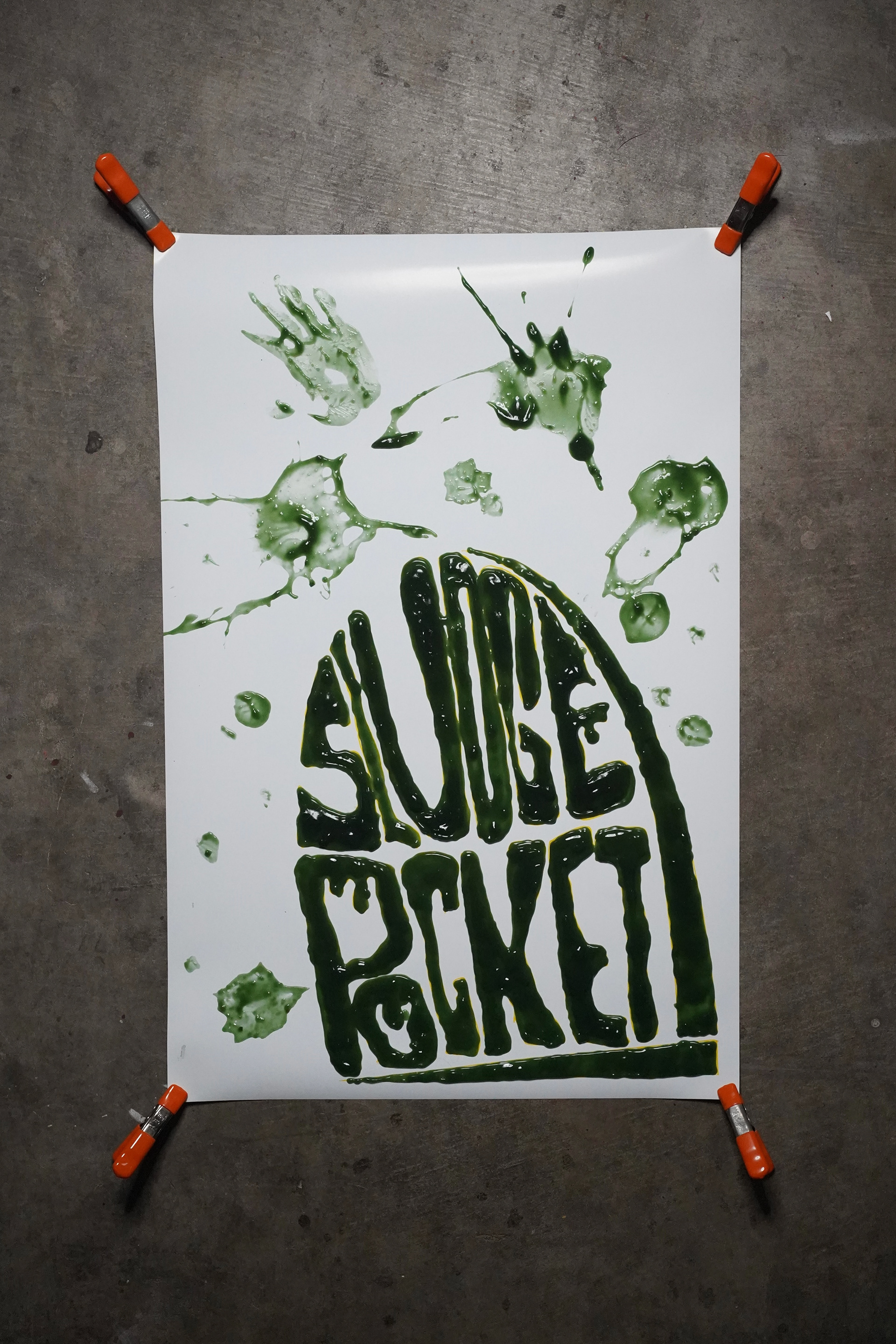
I knew after all my research that I wanted dark hues and a simplistic color scheme. This led me to hues that related more to nature since the name of the group was derived from organic matte—thus leading me to the greens you see in the final designs.
typography
From the get-go, I knew the typefaces needed to be unique and individual to the group. Rugged but stylized and a font that felt like it could be slapped anywhere like a sticker and stand out; so I chose Trip Denied.
To counter such a stylized typeface, I knew I also needed a clean, simple and subtle font for balance and body copy, making Uniform the ideal choice.
Imagery
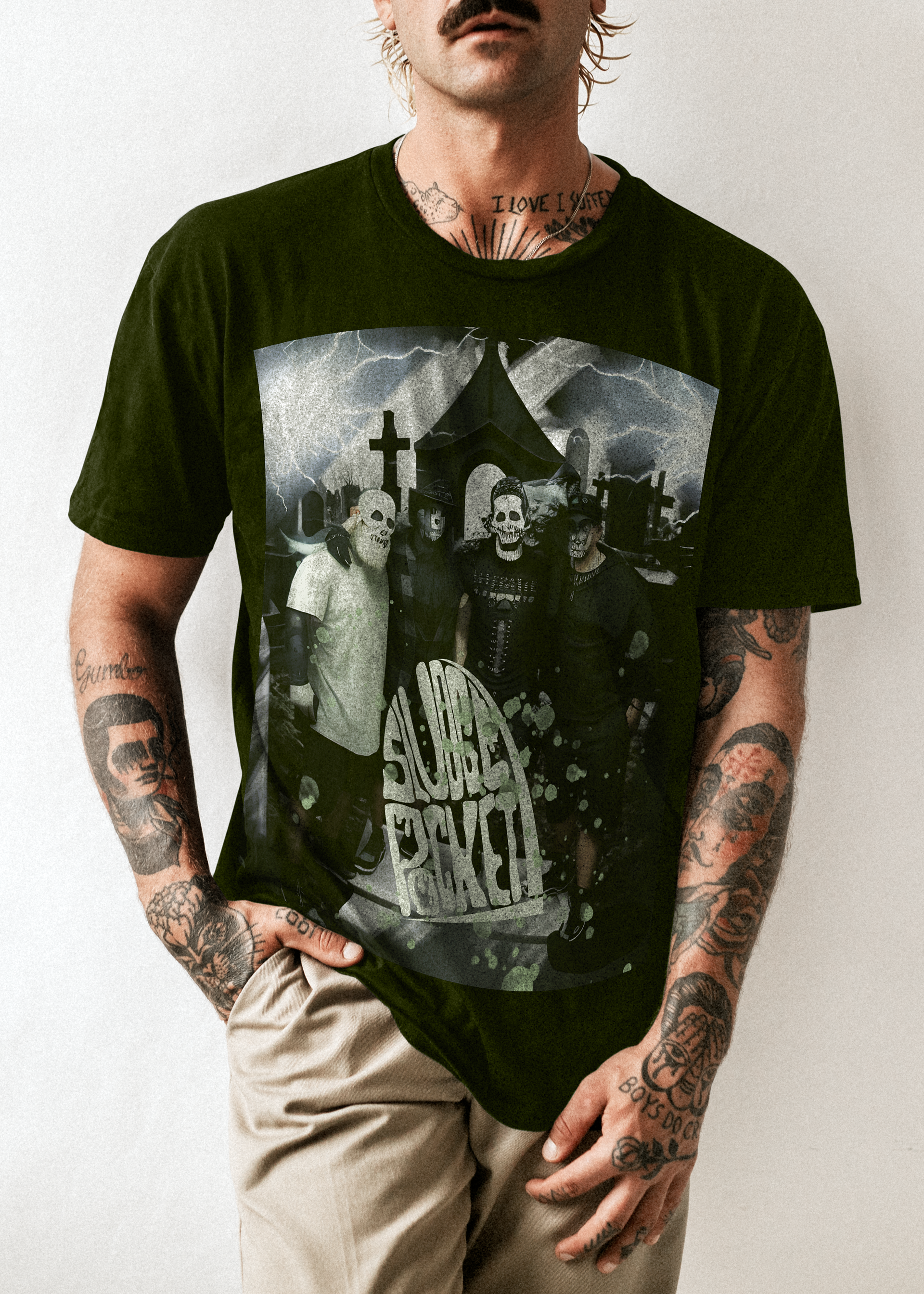
Much of the imagery used in all the designs were taken personally of family friends ( as seen in the merch designs ) as well as some images from my own wedding venue and dress ( as seen in the album artwork ). While I did dive deep into stock images for this project, I felt some of my photography fit the theme best.
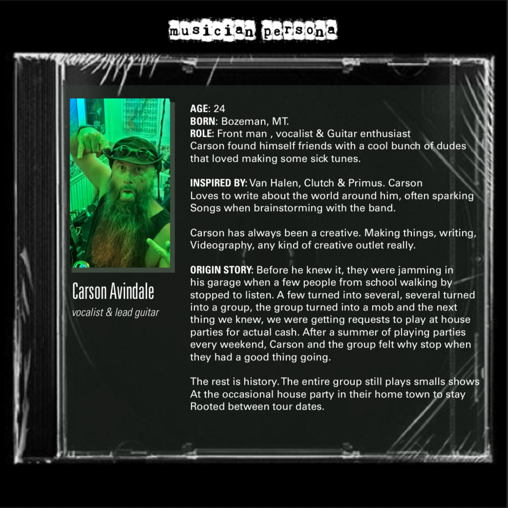
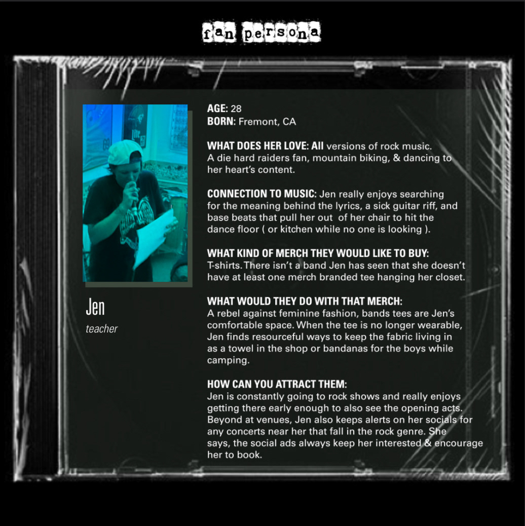
Personas
Expanding on my research, the next step was to develop musician and fan personas to help bring the group to life - at least the band leader who I imagined would act as the leading light for the group as well as the typical fan that would support them.
final designs
the album
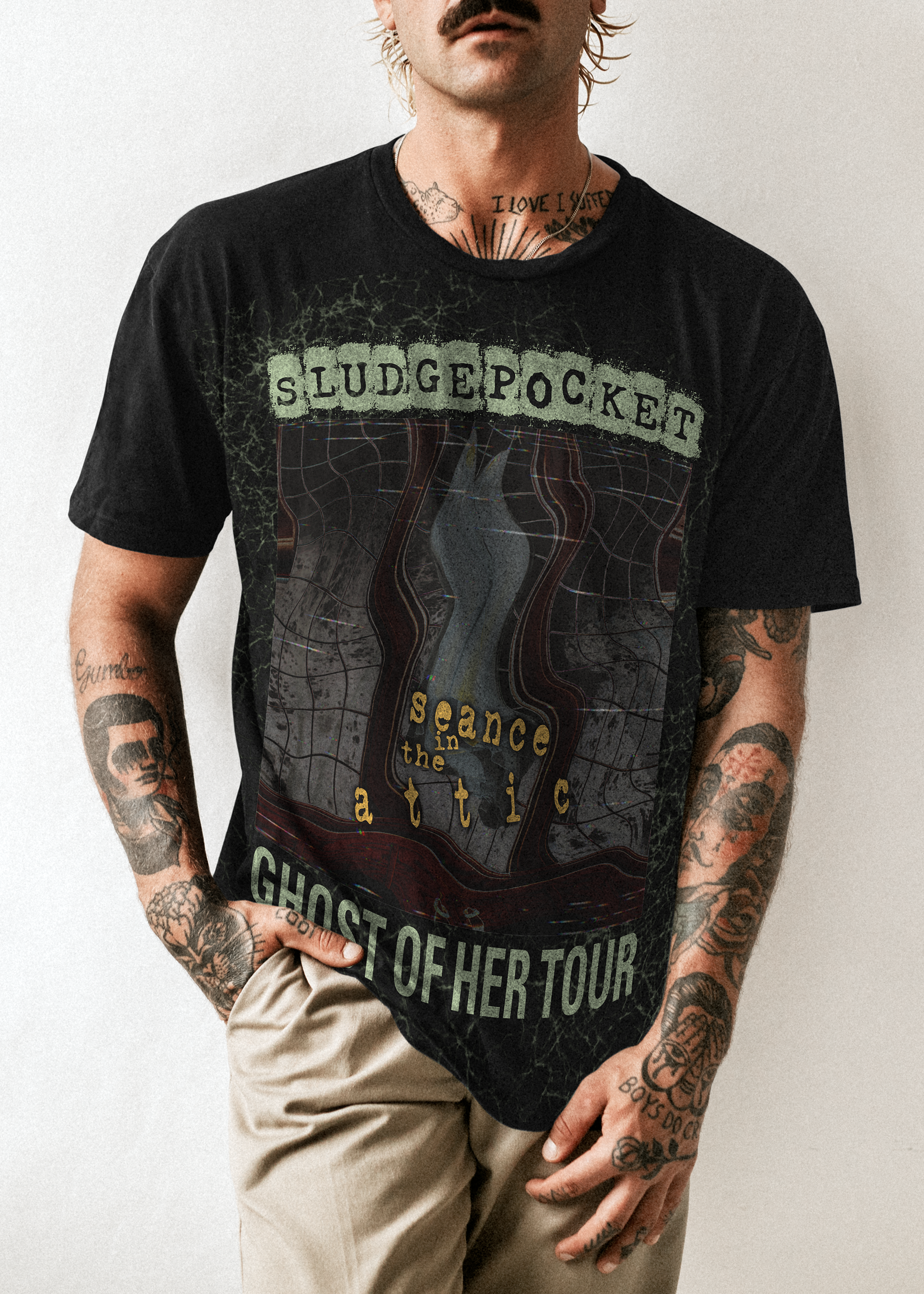
After visualizing the people that make the group, the name and the branding, it was time to develop the album. I needed a record that would further convey the SLUDGEPOCKET personality and theme—which led me to séance in the attic.
For my chosen mediums, I felt that cassette tape and vinyl package would represent the 90's best and would be the right fit for the group.
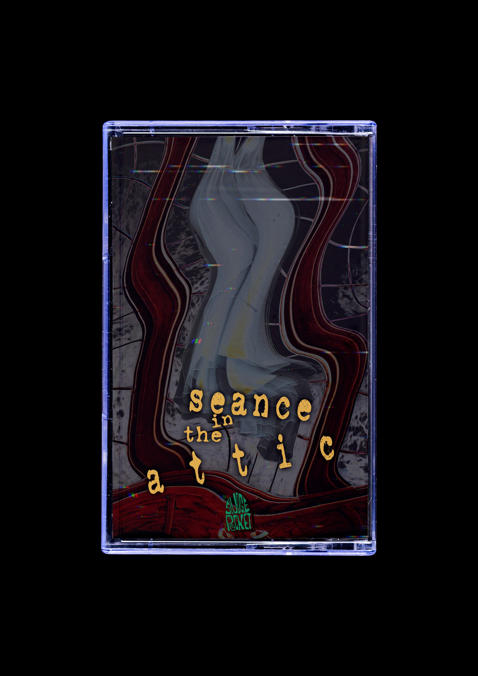
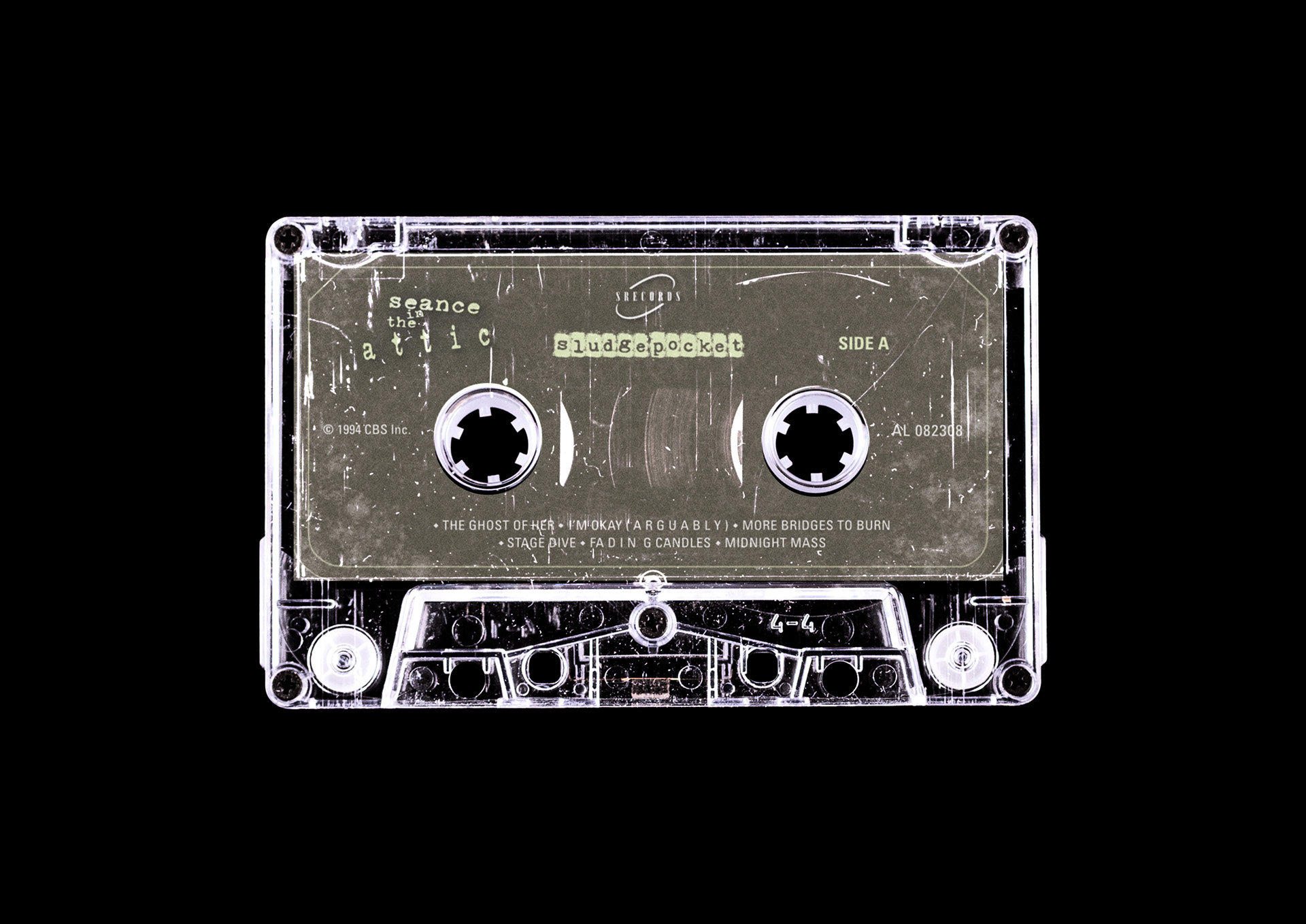
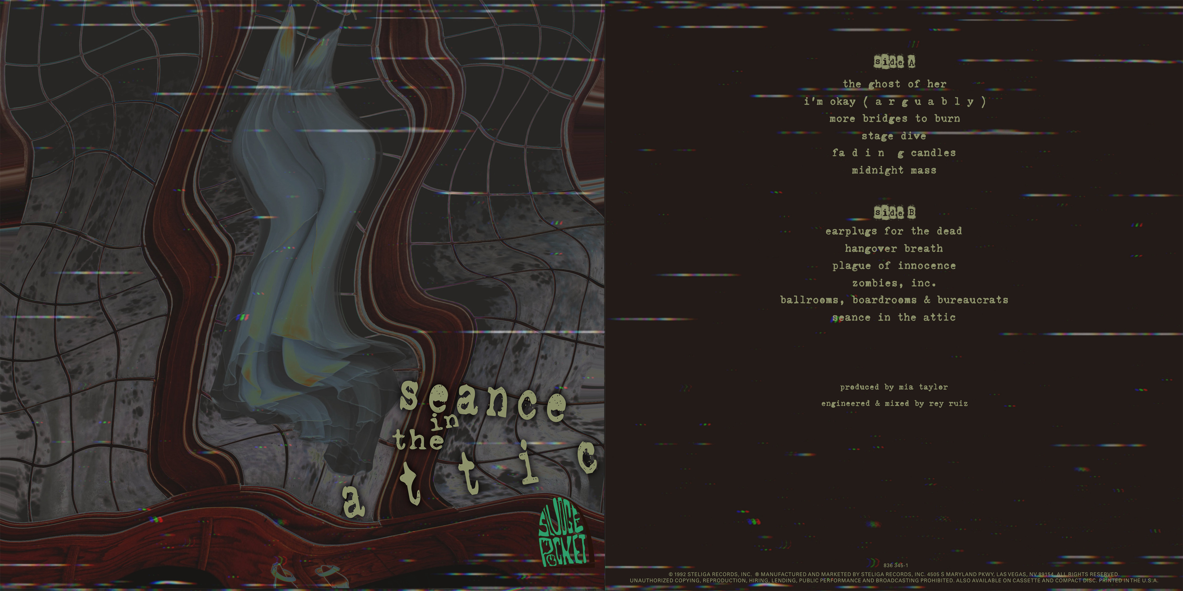
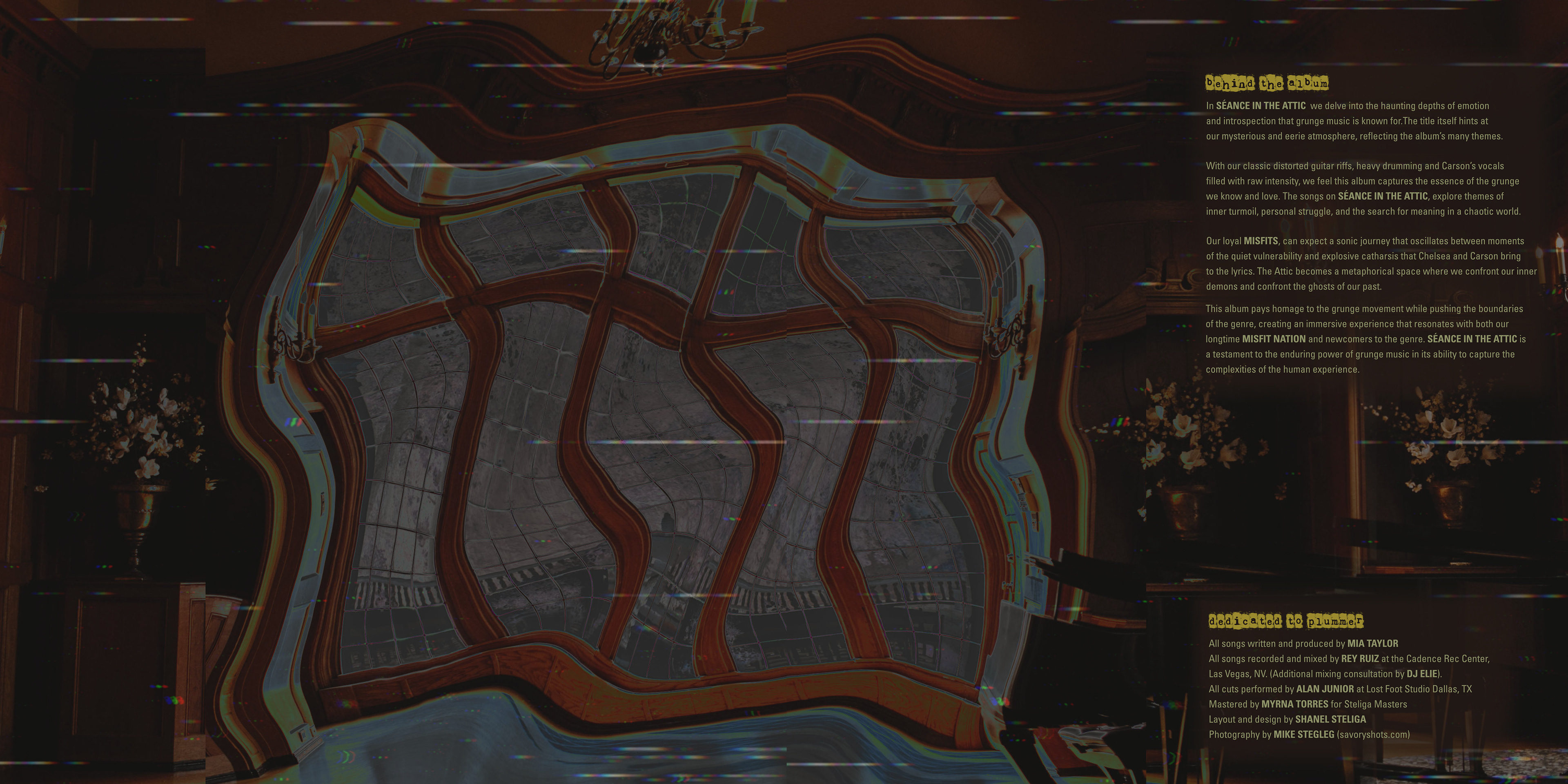
Inside Vinyl Cover

Sleeve
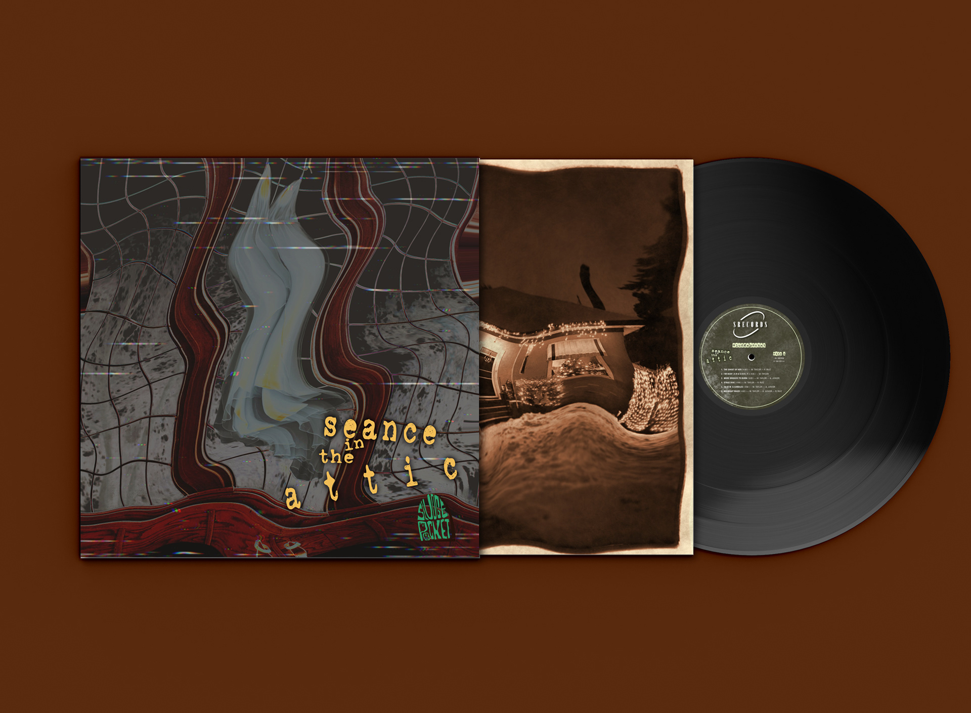
Vinyl Package
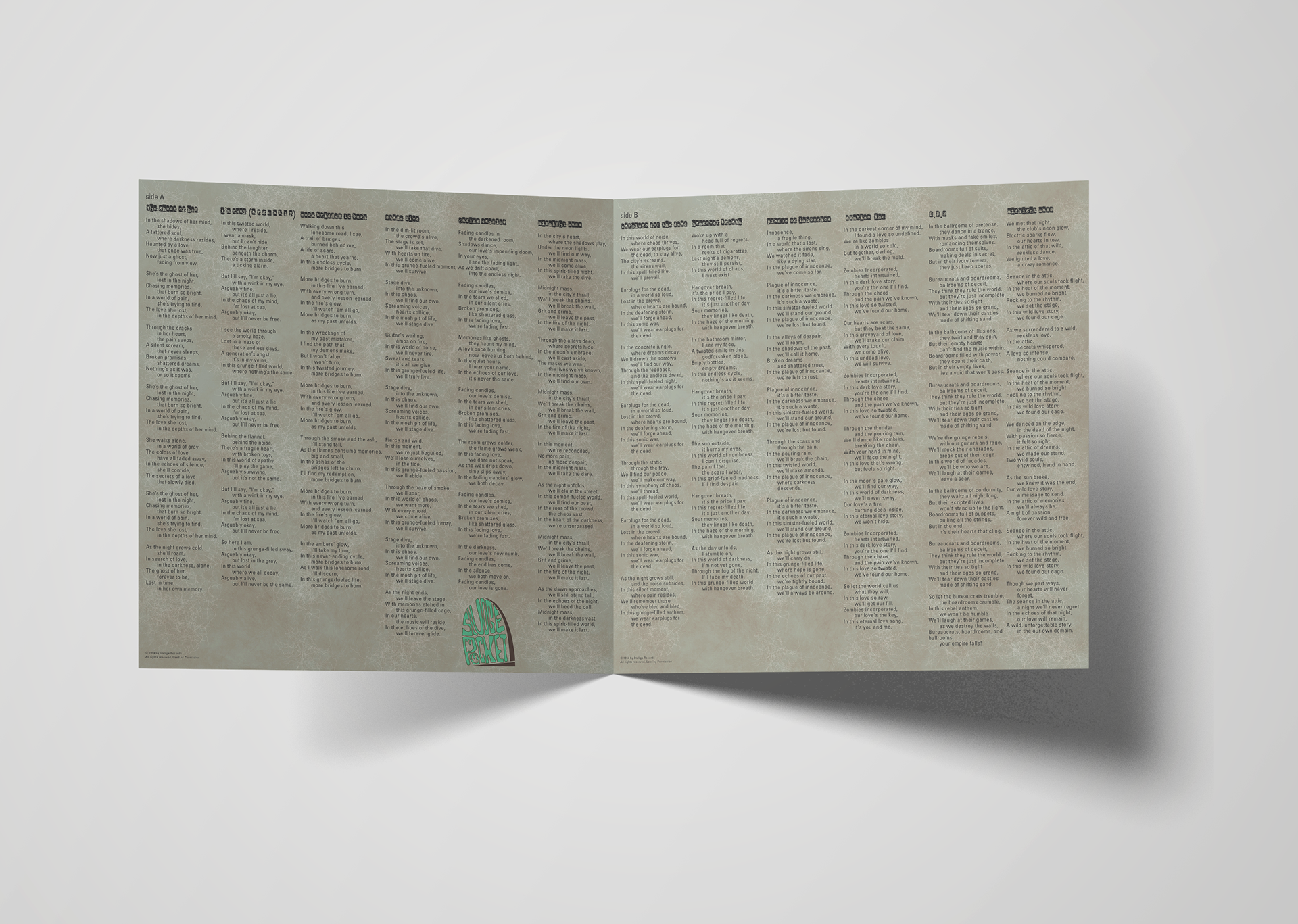
Lyrical Insert
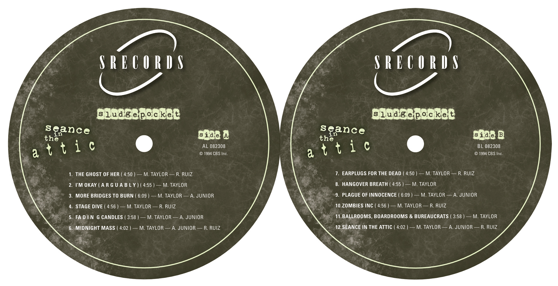
Side A + Side B Labels
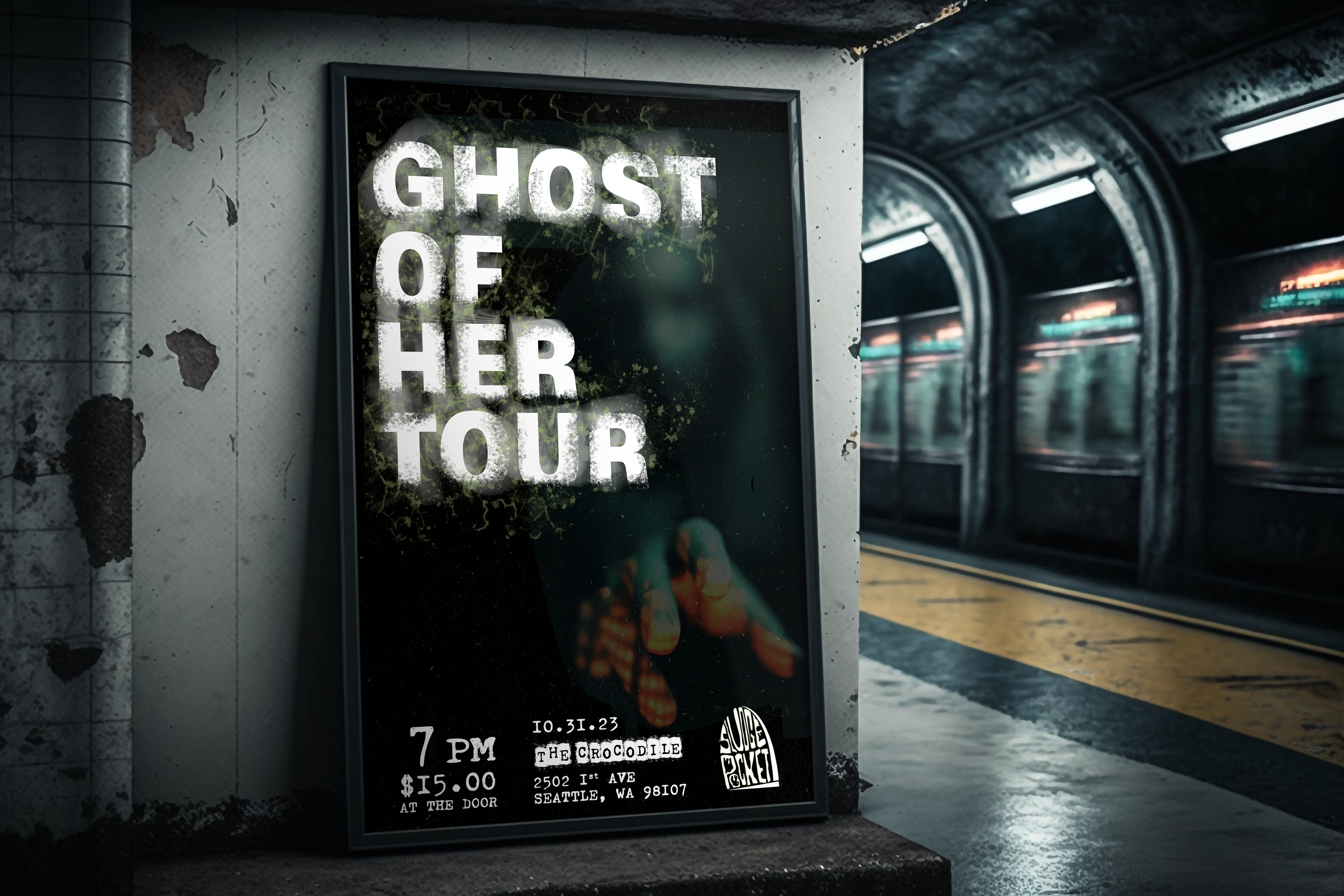
The Tour
For the tour, I doubled down on the séance theme and called the tour—Ghost of Her to also connect to the wedding dress that was depicted in the album cover.
Here you will need marketing poster intended for train stations and the like, a handbill layout, stylized concert ticket, and a VIP backstage pass.


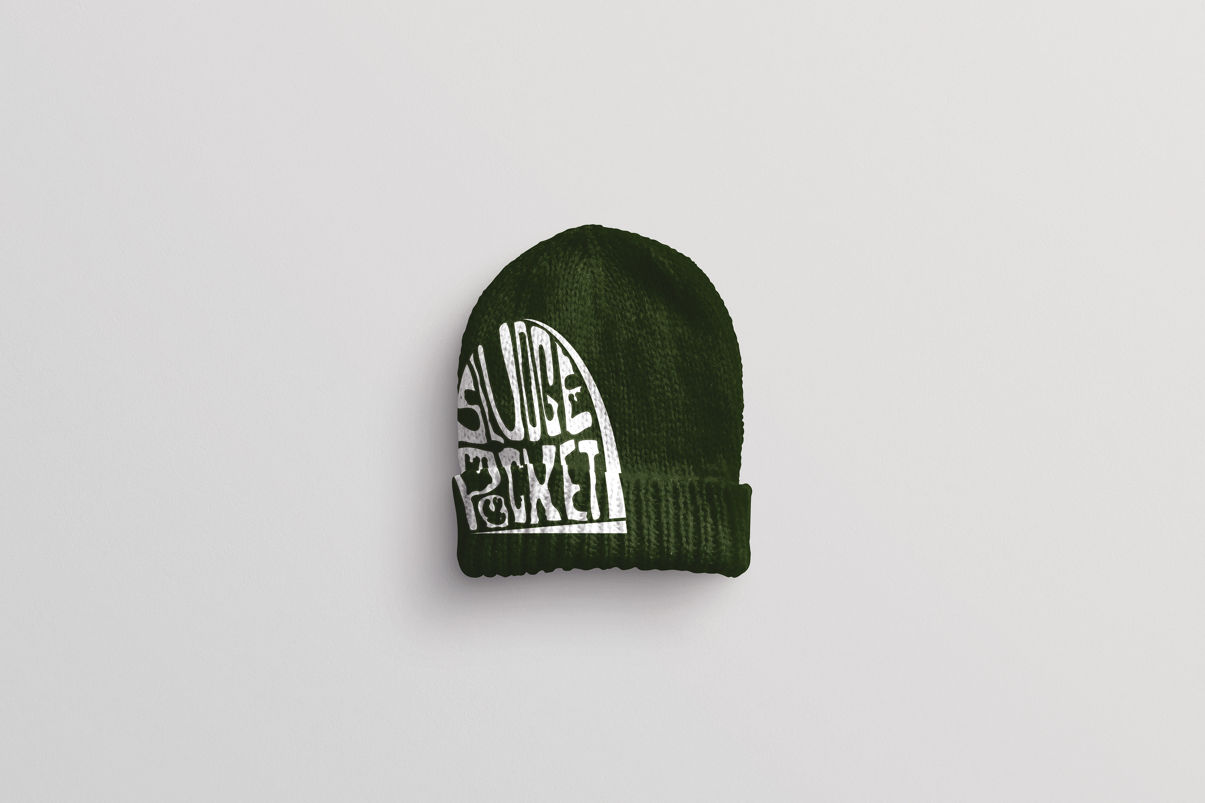
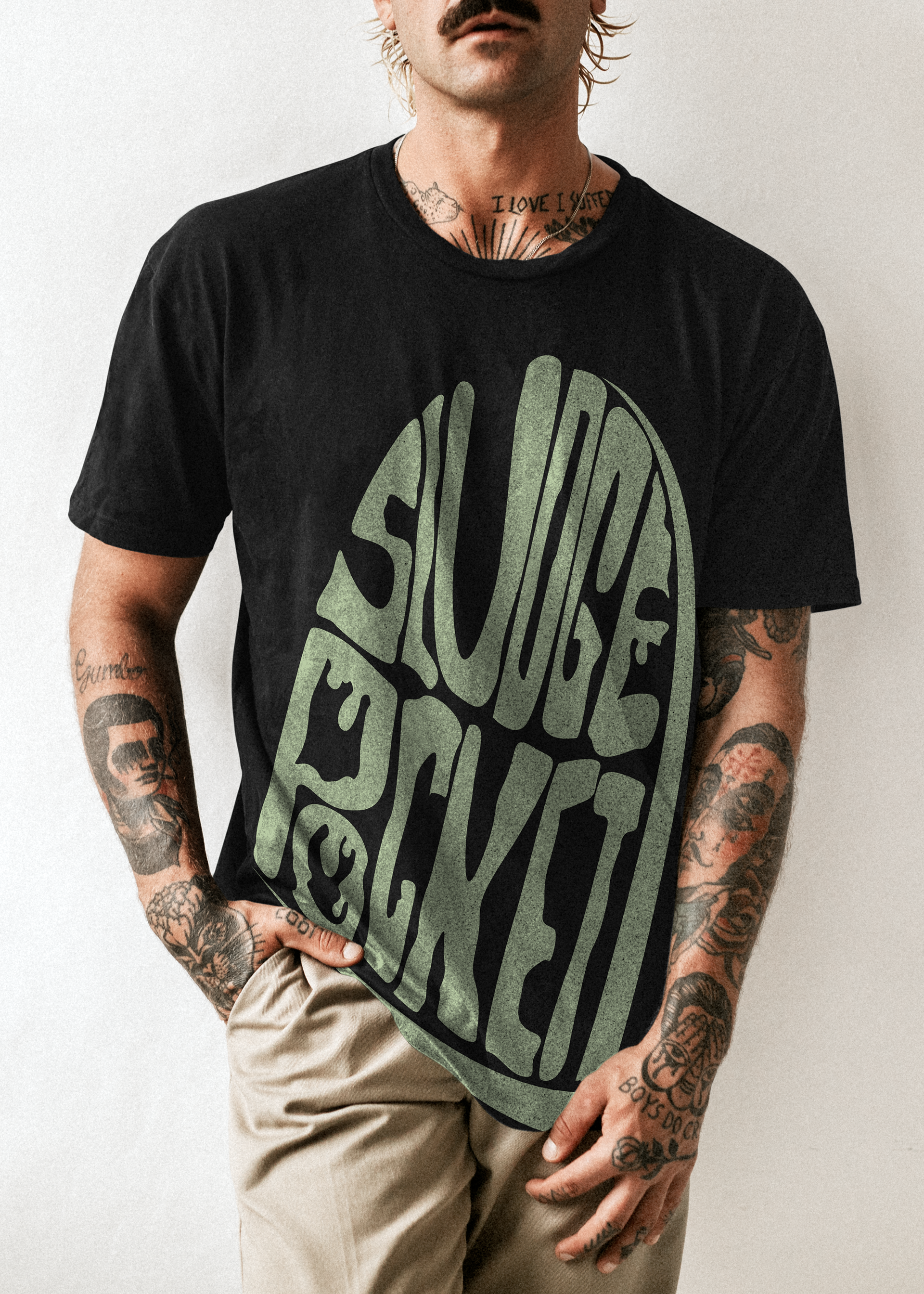
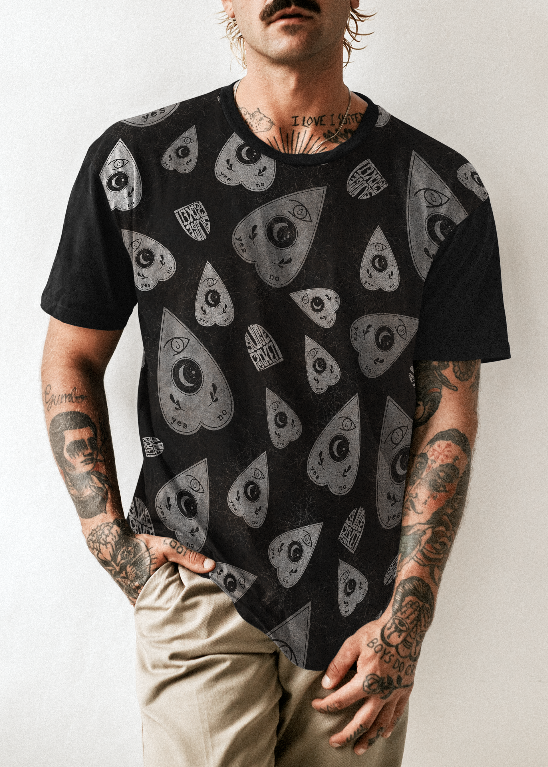
Merch
While the brand overall shows a maximalist approach to designs, I wanted to try and keep a few options simple while also displaying the other iteration of the SLUDGEPOCKET logo on one of the tees.
Displayed:
Alt physical poster for additional promotion—in the 90's these were given away to VIP members or special guests at shows.
4 Styles of Tees
1 Signature Beanie
Final Thoughts
Challenges
This project was difficult to start in that the task itself was develop a band in a genre that is no longer around and while I do have a bit of musicality in me, creating a band was not something I was necessarily interested in. This being the first project I needed to create personas for also pushed my imagination to have more purpose than before.
insights
Although I did find the starting line to be challenging, once the train was rolling we were certainly on a roll. I deeply enjoyed the process of pushing myself and in an odd way allowed myself to feel more vulnerable—especially with the use of my own photographs of friends and family. I feel my understanding of promotion layouts and merchandise guidelines grew exponentially and is something I will certainly keep in mind as I approach similar projects in the future. I also discovered an interest of helping up and coming artists now in the development of their own brand as they try to climb the charts.